Integrate Iconify
This user guide walks you through the process of integrating Iconify into a Docusaurus project.
Install the Iconify React package
Install the Iconify React package into your project directory:
npm install @iconify/react
or, if you use Yarn:
yarn add @iconify/react
Configure MDX components
At src/theme/, create a file named MDXComponents.js with the following code:
import React from 'react';
// Import the original MDX components mapping from Docusaurus
import MDXComponents from '@theme-original/MDXComponents';
// Import the Icon component from Iconify
import { Icon } from '@iconify/react';

export default {
  // Spread the default mappings so you don't lose existing components
  ...MDXComponents,
  // Add a new component called Icon that maps to the Iconify Icon
  Icon,
};
This file tells Docusaurus to make the Icon component available in all your MDX files as <Icon />.
Use Iconify icons in markdown files
Once the configuration is in place, you can use Iconify icons in any markdown file.
To add an Iconify icon, follow these steps:
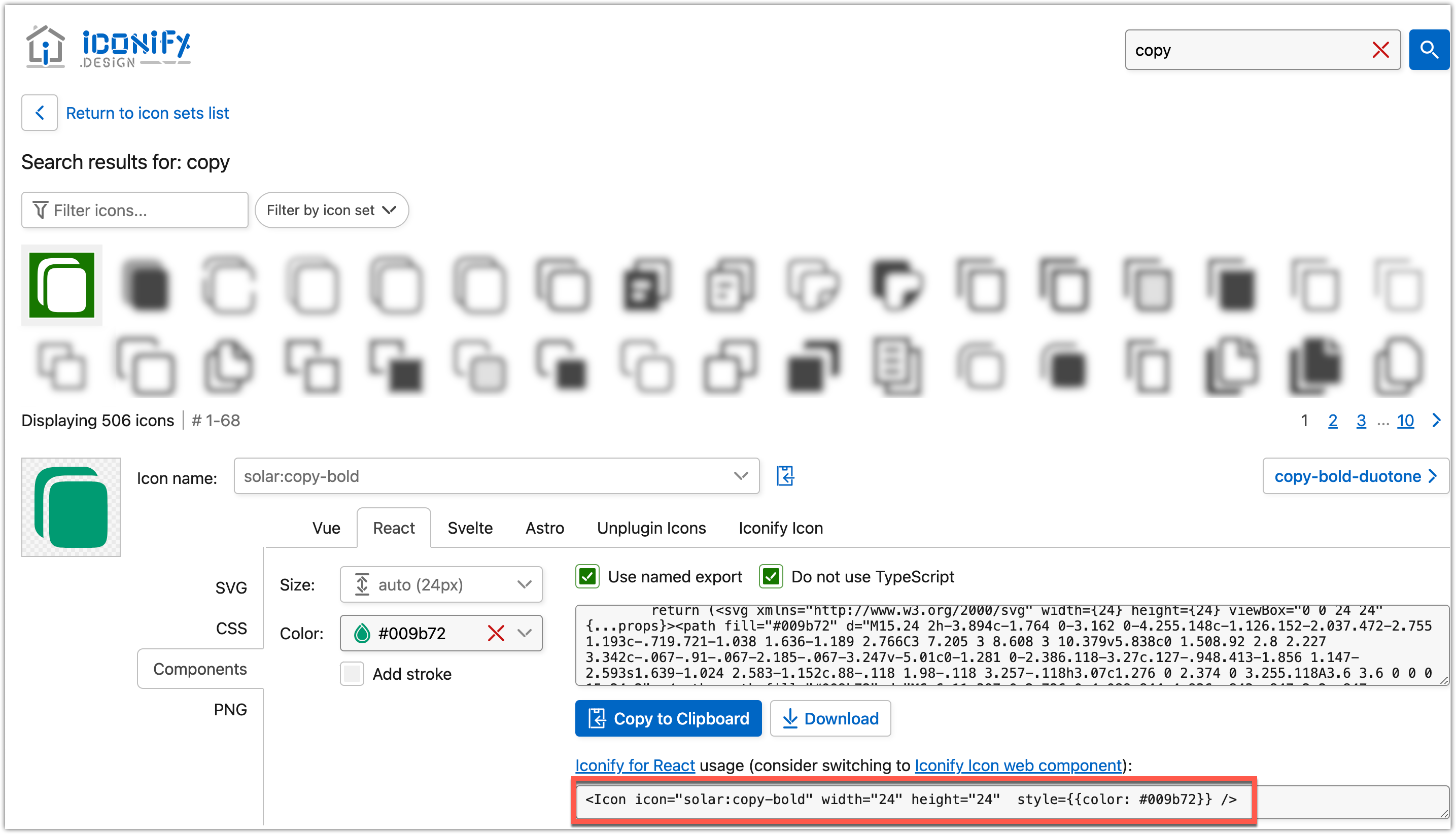
- Visit the Iconify design page and search for the icon you need.
- To configure its parameters, click the icon
- In the React tab, configure the icon:
- For Size, set the size in pixels
- For Color, set the needed color.
- Copy the component.
-
In your markdown file, add the component at the desired location.
-
Adjust the component to look as follows:
<Icon icon="*ICON_NAME*" width="*ICON_WIDTH*" height="*ICON_HEIGHT*" style={{ color: '*HEX_COLOR_CODE*' }} />ICON_NAME: The name of the icon—for example,solar:copy-bold.ICON_HEIGHT: The height of the icon—for example,24for 24px.ICON_WIDTH: The width of the icon—for example,24for 24px.HEX_COLOR_CODE: The hex color code for the icon—for example,#009b72.
After your configurations, your component can look as follows:
<Icon icon="solar:copy-bold" width="24" height="24" style={{ color: '#009b72' }} />
Using both width and height parameters is optional, so you can leave only one—for example: <Icon icon="solar:copy-bold" height="24" style={{ color: '#009b72' }} />
Restart your server
After making these changes, restart your development server:
npm run start
or, if you use Yarn:
yarn start
Example usage
This section shows how to use Iconify icons in your project.
Create or update a file, for example docs/example.md, with the following text sample:
This is a green copy icon with 24px height: <Icon icon="solar:copy-bold" height="24" style={{ color: '#009b72' }} />
It's rendered as follows:
- Raw text
- Rendered text
This is a green copy icon with 24px height: <Icon icon="solar:copy-bold" width="24" height="24" style={{ color: '#009b72' }} />
This is a green copy icon with 24px height: